
 We’ve recently completed a cosmetic surgeon website re-design. Dr. Robert Langdon, owner of The Langdon Center in Guilford, CT, has been a marketing client of Turbo’s for several years. He’s double board-certified in dermatology and cosmetic surgery.
While his marketing efforts have been providing an increasing stream of traffic and leads over the past couple years, his website was a bit outdated. Dr. Langdon’s website had many of the right pieces in place – such as our photo gallery, a sticky mobile footer menu, solid social proof throughout the site – but it just needed a facelift.
Our goal was to up re-design the website – keeping the same color scheme – to give it a more modern look overall, while improving the procedure page layout and mobile layout. You can click here to visit the new website. Here are some of the features of the new website, which we developed on WordPress:
- fully custom design
- fully “responsive” layout with “sticky” mobile calls to action
- parallax page components
- improved navigation
- Turbo photo gallery
- social media integration
- full search engine optimization
- blog integration
- web forms for improved lead generation
- fully secured via SSL
You can see the difference in the before and afters below, although it’s harder to tell some of the improvements without scrolling through the site. The old website had a taller header, which pushed content down further. It also lacked a sticky header on desktop, so when you scrolled down you wouldn’t have easy access to the menu. On the new home page we improved the featured where you can find a procedure by body area, and we highlighted Dr. Langdon and his expertise more prominently.
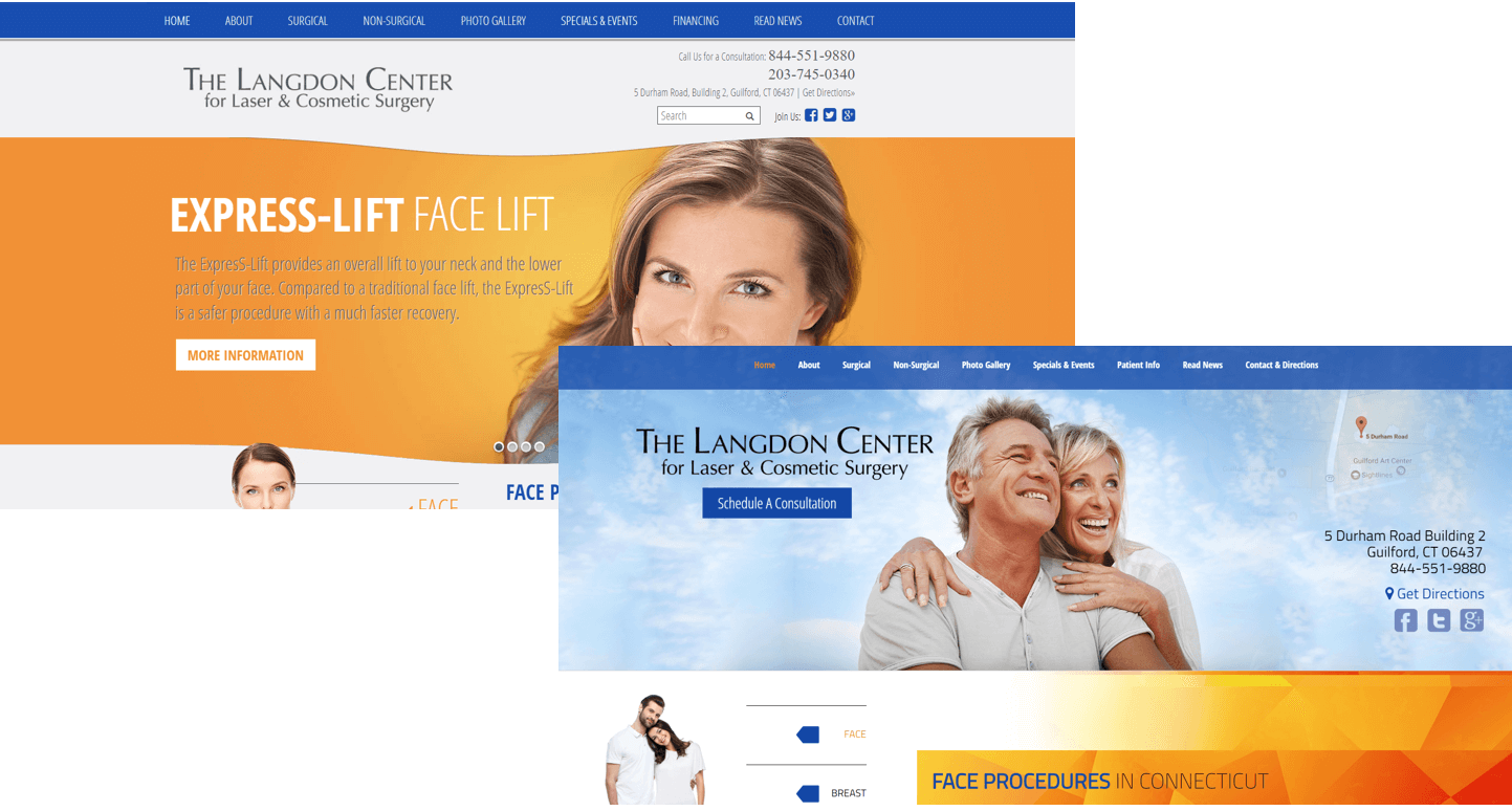
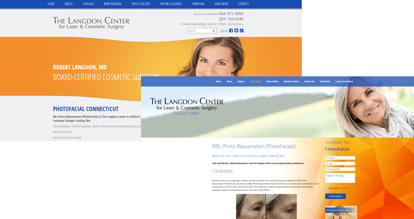
Most of the inner pages relied heavily on stock photos, so we worked in more social proof, including relevant before & after photos, with links to the gallery, as well as well videos, within the text of these pages.
Arguably the biggest issue with the inner pages on the old site was that the title bar image at the top was the same for every page, including the home page, so you couldn’t really tell you’ve even successfully loaded a new page, since the majority of the page – the area “above the fold” – looked the same. For those looking on laptops, or even worse, mobile phones, each page above the fold looked exactly the same. Our new layout allows for content to show up higher on the page…
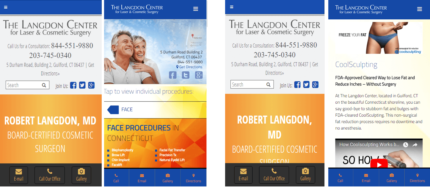
As noted above, on mobile, you couldn’t tell you had actually gone to a new page. That’s the biggest problem that we addressed. The old site (visible to the left of the new site screenshots below) had a sticky footer, but we enhanced it, adding a 4th button for Directions. We also made the menu icon at the top “sticky” so patients on their smartphones can easily open up the menu from anywhere on a given page.
If you’d like see a breakdown of all our most recent projects click here, or you can check out our portfolio of website work here. If you’d like to learn more about WordPress conversions, or re-designing your existing website, then send TRBO a note here. You can also reach us directly at 877-673-7096 x2.


