

If you’ve gone through a website update in the past year or so, or you’re simply on top of the latest trends in website design, you’ve more than likely heard the term “UX” thrown around. For those who don’t know what UX means, it stands for user experience.
It’s not as if websites built five or ten years ago completely ignored user experience, but with more web-savvy patients searching online, user experience becomes that much more vital. Simply put, people want answers fast, and they’ve come to expect it, and if there’s anything that’s preventing or slowing them from finding answers then they’ll look elsewhere.
Once someone has landed on your website, you’re over halfway there toward generating a lead, and potentially a new patient. While I often focus on the call to action, which is vital to lead generation, I want to take a step back with this article and focus on user experience as a whole.
Here are some tips for providing the best user experience:
1) Slow load times and dead links: this is an essential first step for a great user experience. Make sure your website is loading quickly by using this free tool. You can test for broken links using this free tool and by keeping an eye on your Google Webmaster Tools account.
2) Simplify the navigation: Try to break down all your pages into 7-8 main navigation links, maximum. A cluttered, disorganized or overcrowded navigation will turn patients off. Focus on what they’re looking for (the most viewed pages on aesthetic websites): your before & after gallery, your procedure pages, your address, and a form to contact you. Also, avoid drop down menus that have a sub-menu, or worse, the dreaded sub-sub-menu! Try to organize all your procedures under a single drop down with no sub-menu.
3) Use of “white space”: Similar to #2, we want to reduce clutter, especially on the home page. Not every square inch of your website needs a module about another service or a written testimonial. Using large images can help break up text, which makes each of the sections of your website more readable. Just imagine this blog with no images. Wouldn’t it seem very text-heavy? You’d probably be less inclined to read it if there were no images. This is why you need to break up your content with good use of white space.
4) Focus on mobile effectiveness: Yes, I realize that mobile responsiveness has been beat to death over the past year, to the point where it’s not even worth mentioning…except it is worth mentioning. Why? Even if your website responds and passes Google’s test you still need to think about how easy is it for a patient to navigate, tap to call or email, and sort through your photo gallery from a cell phone. This is what I mean by “mobile effectiveness.” Do you have a sticky navigation or sticky calls to action? This means that no matter how far down the patient has scrolled they’ll always see a navigation, call or email button at the top of their screen. Furthermore, if you follow #3 and adhere to optimal white space you’ll inevitably make it easy for patients to tap banners and links more easily, and there will be less content bunched together (which can result in an accidental tap of the wrong link or button).
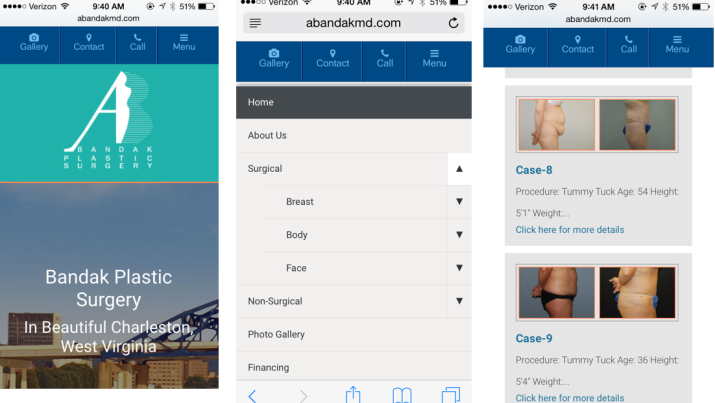
5) Too many text fields on your web forms: In most cases I’d recommend a shortened web form at the top of your sidebar for all inner pages or your website, to go along with a form on your home page and a more thorough form on your contact page, if necessary. Avoid overly lengthy forms as they can dissuade even a very interested patient from filling it out. This is especially true for mobile users. Make sure that your forms don’t get pushed down too far on the page. If a mobile user clicks to access a form it should show up right at the top of that page.
If you’d like to learn more about improving your website’s user experience, or inquire about a website re-design, drop TRBO a line here or call us directly at 877-673-7096 x2.


