Let me start out by saying that sliders are not bad, they should just be avoided on an aesthetic practice website home page (or on any page).
Before we jump into the “why,” lets first define the term “slider.”
What is a Slider?
A “slider” on a website simply refers to a content area that has multiple slides, usually banners or images, that rotate showing different content on each slide.
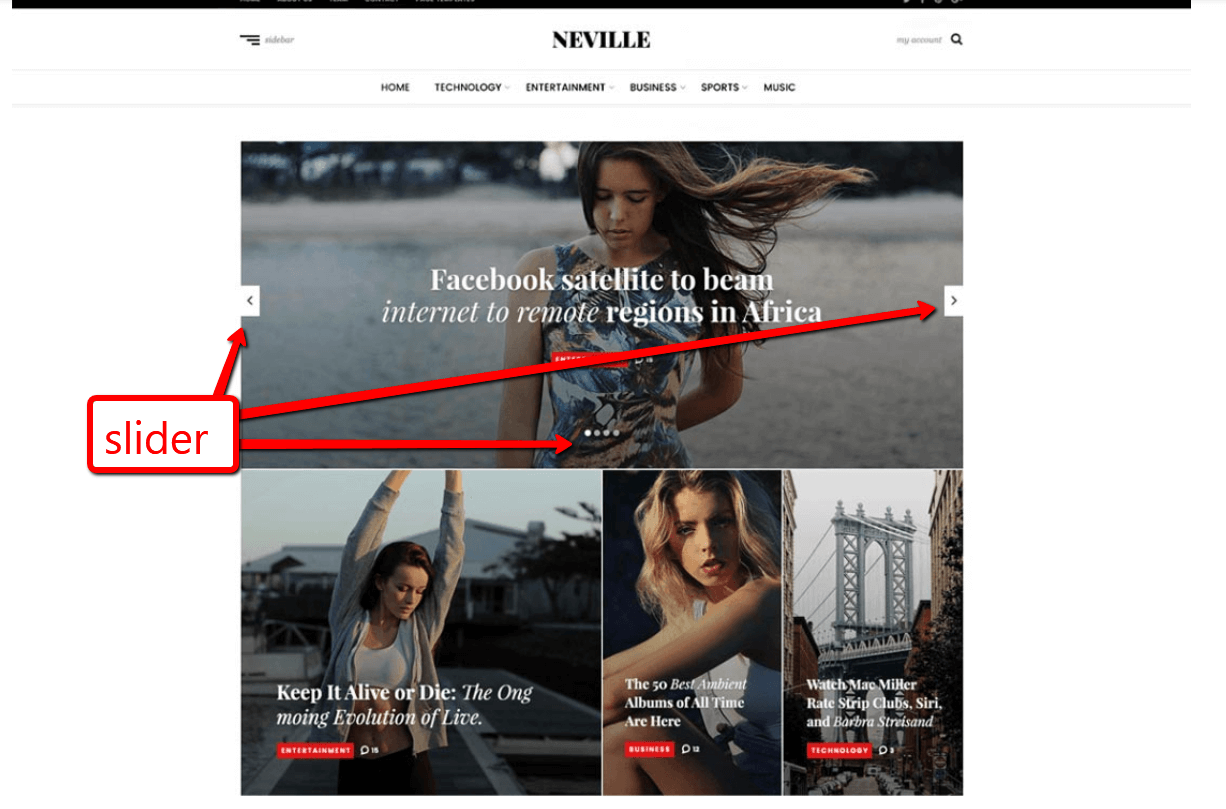
Sliders can appear anywhere on the website. Here are the most common types of sliders used on aesthetic practice websites:
- Testimonial sliders
- Before and after image sliders
- Specials & Promotions sliders
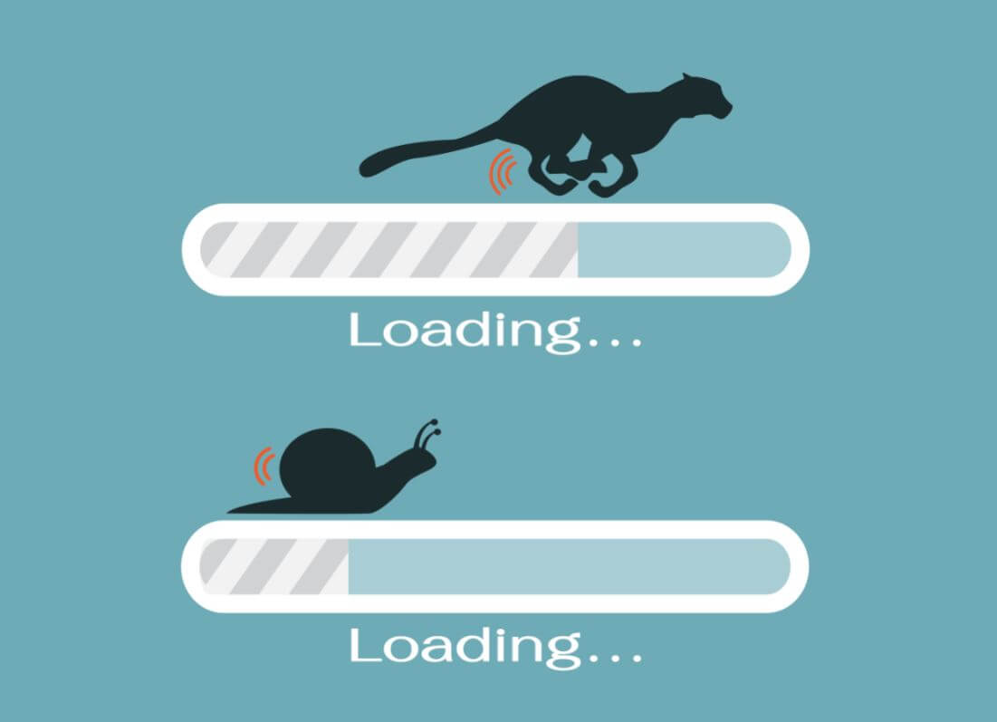
These types of sliders are ok to use, sparingly. However, one of the biggest drawbacks to sliders is that they slow your website down. Some of the aforementioned sliders utilize smaller images while they can still slow the site down, so they affect site speed less than a “hero image” slider…
The “Hero Image” Slider:
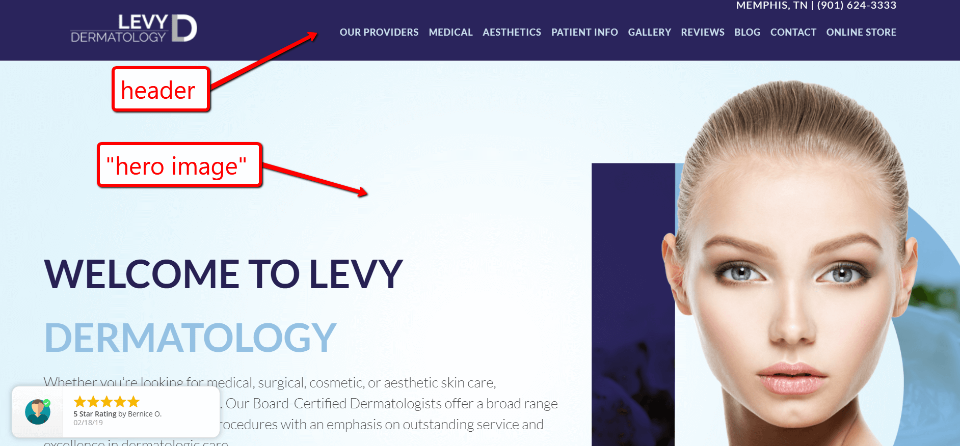
The hero image is the first thing that prospect sees when they get to the homepage of your website. This is your “banner area” that’s above-the-fold, typically right below your header and navigation or part of your website’s header.
How Did Sliders Get So Popular?
Using a slider in the hero image area may seem to be a great idea when these elements are present in your practice:
- You have multiple “perfect prospects” that you want to appeal to
- You had a slider on your site and you “liked it”
- You want prospects to see MANY things when they first get to your site
All of these things make sense on the surface and explain why sliders grew in popularity. Unfortunately, these reasons are not good enough to forego best practice for user experience and we’ll explain why…
Why Sliders on the Home Page Are a Bad Idea:
Let’s circle back to the main focus of this article: sliders on the homepage. Specifically, what I’m specifically referencing is the use of a slider as the “hero image” or “header area” of the home page.
Let me count the reasons why…
- Site speed: one of the biggest issues
- Outdated design style
- Sliders involve movement, which the human eye follows, and that distracts from the information on your website that actually matters, such as your value proposition (why the prospect should do business with your practice)
- Sliders as the hero image on the homepage create a lot of “noise” or visual clutter, which distracts from…
- The ONE BIG thing, which should be the focus of your website’s home page – telling visitors EXACTLY the value you deliver – is not the only thing if that area of the site rotates
- very few people see beyond the first slide anyway…
Studies Back Up Why Sliders Are Bad:
According to a Notre Dame study, only 1% of website visitors clicked any of the slides and 84% did not even look beyond the first slide.

Additionally, usability guru Jakob Nielson ran a study and found that sliders are ignored by users.
Most website developers and conversion rate optimization experts agree that sliders are bad, and some would go so far as to say they’re “evil!” You can learn more about these fervent opinions in this article from one of the Godfather’s of CRO (Conversion Rate Optimization), Peep Raja.
Ok, Sliders Are Bad, But What Should the Hero Image Should Focus On?
The hero image or main banner area on a homepage needs to accomplish a few things for proper UX (user experience), but the primary goal is to create relevance for the prospect.
What does that mean? Well, we need to be able to create a logical case for the prospect to INVEST MORE TIME reviewing your website, and with that more time, we’d like to educate them and ultimately convince them to take action.
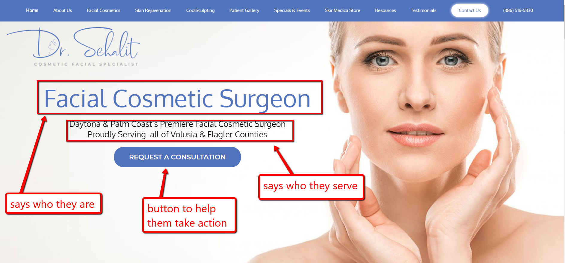
In order to create relevance for a prospect we need a few key elements present:
- A geographic identifier
- A business name that very likely offers what the prospect is searching for (fulfills his/her need or want)
- The one big thing that your practice does
- A call to action that allows the prospect a way to reach our RIGHT AWAY – we suggest using “Request A Consultation” call to action as it sets the tone for why the prospect is reaching out (NOT to ask a question or get pricing)
- Related imagery that corresponds with either the main patient “avatar” (your perfect prospective patient), OR an image of the doctor, your office building, local imagery that is very recognizable, etc
The bottom line is that the prospective patient HAS to be able to determine that they are in the right spot.
Not Sure If Your Website is Optimized for Conversion Rate?
The first step is getting a CRO (conversion rate optimization). The good news is that we can help! If you’d like to schedule a CRO with Clayton Joyner to find out how you can unlock additional leads on your website then by filling out the form here. You can also give us a ring at 877-673-7096 x2.